mirror of
https://github.com/home-assistant/iOS.git
synced 2026-04-21 07:36:53 -05:00
 2fbec06ee2
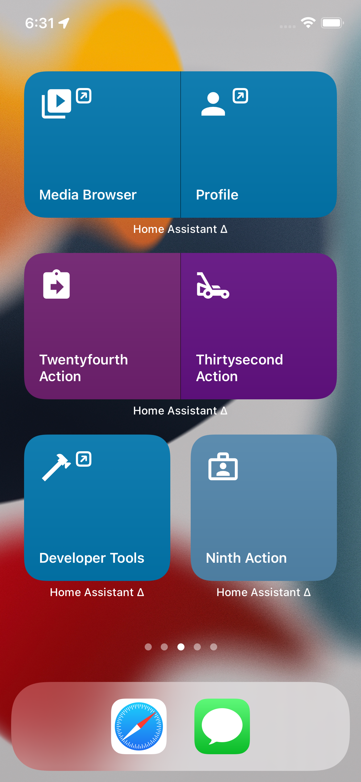
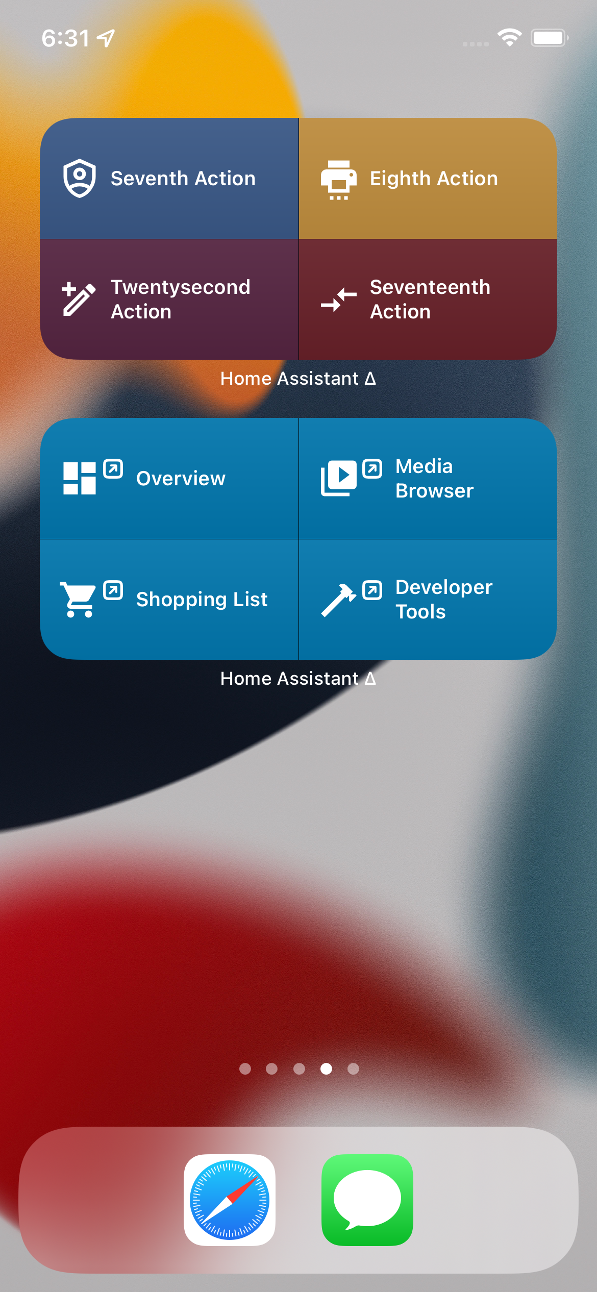
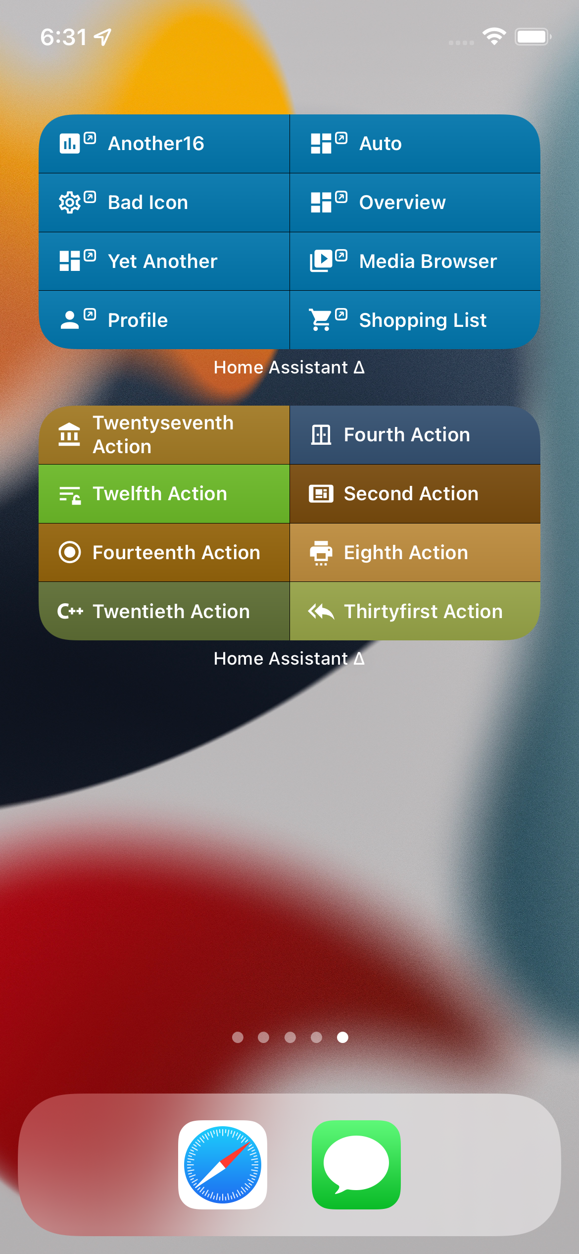
## Summary
Styles with a background and a decorator icon to differentiate it from actions.

## Screenshots
| Small/Expanded | Normal | Full |
| -- | -- | -- |
| <img width="200" src="https://user-images.githubusercontent.com/74188/135736388-e685feaa-d368-470b-b66d-38ca5ccd1415.png"> | <img width="200" src="https://user-images.githubusercontent.com/74188/135736392-ee55289b-8ff4-435c-93c7-98b5c0044e44.png"> | <img width="200" src="https://user-images.githubusercontent.com/74188/135736394-a331cb63-066b-4e48-bcd2-b3c859072377.png"> |

## Any other notes
- Adds a small gradient on top of both widget kinds.
- Supports doing an on-the-fly MDI migration if we encounter an icon that was deleted/renamed.
154 lines
4.0 KiB
Swift
154 lines
4.0 KiB
Swift
import Foundation
|
|
import Shared
|
|
import SwiftUI
|
|
|
|
struct WidgetBasicViewModel: Identifiable, Hashable {
|
|
init(
|
|
id: String,
|
|
title: String,
|
|
widgetURL: URL,
|
|
icon: MaterialDesignIcons,
|
|
showsChevron: Bool = false,
|
|
textColor: Color = Color.black,
|
|
iconColor: Color = Color.black,
|
|
backgroundColor: Color = Color.white
|
|
) {
|
|
self.id = id
|
|
self.title = title
|
|
self.widgetURL = widgetURL
|
|
self.textColor = textColor
|
|
self.icon = icon
|
|
self.showsChevron = showsChevron
|
|
self.iconColor = iconColor
|
|
self.backgroundColor = backgroundColor
|
|
}
|
|
|
|
var id: String
|
|
|
|
var title: String
|
|
var widgetURL: URL
|
|
|
|
var icon: MaterialDesignIcons
|
|
var showsChevron: Bool
|
|
|
|
var backgroundColor: Color
|
|
var textColor: Color
|
|
var iconColor: Color
|
|
}
|
|
|
|
enum WidgetBasicSizeStyle {
|
|
case single
|
|
case expanded
|
|
case condensed
|
|
case regular
|
|
|
|
var textFont: Font {
|
|
switch self {
|
|
case .single, .expanded:
|
|
return .subheadline
|
|
case .condensed, .regular:
|
|
return .footnote
|
|
}
|
|
}
|
|
|
|
var iconFont: Font {
|
|
let size: CGFloat
|
|
|
|
switch self {
|
|
case .single, .expanded:
|
|
size = 38
|
|
case .regular:
|
|
size = 28
|
|
case .condensed:
|
|
size = 18
|
|
}
|
|
|
|
return .custom(MaterialDesignIcons.familyName, size: size)
|
|
}
|
|
|
|
var chevronFont: Font {
|
|
let size: CGFloat
|
|
|
|
switch self {
|
|
case .single, .expanded:
|
|
size = 18
|
|
case .regular:
|
|
size = 14
|
|
case .condensed:
|
|
size = 9
|
|
}
|
|
|
|
return .system(size: size, weight: .bold)
|
|
}
|
|
}
|
|
|
|
struct WidgetBasicView: View {
|
|
let model: WidgetBasicViewModel
|
|
let sizeStyle: WidgetBasicSizeStyle
|
|
|
|
init(model: WidgetBasicViewModel, sizeStyle: WidgetBasicSizeStyle) {
|
|
self.model = model
|
|
self.sizeStyle = sizeStyle
|
|
MaterialDesignIcons.register()
|
|
}
|
|
|
|
var body: some View {
|
|
ZStack(alignment: .leading) {
|
|
model.backgroundColor
|
|
|
|
Rectangle().fill(
|
|
LinearGradient(
|
|
gradient: .init(colors: [.white.opacity(0.06), .black.opacity(0.06)]),
|
|
startPoint: .top,
|
|
endPoint: .bottom
|
|
)
|
|
)
|
|
|
|
let text = Text(verbatim: model.title)
|
|
.font(sizeStyle.textFont)
|
|
.fontWeight(.semibold)
|
|
.multilineTextAlignment(.leading)
|
|
.foregroundColor(model.textColor)
|
|
.lineLimit(nil)
|
|
.fixedSize(horizontal: false, vertical: true)
|
|
|
|
let icon = HStack(alignment: .top, spacing: -1) {
|
|
Text(verbatim: model.icon.unicode)
|
|
.font(sizeStyle.iconFont)
|
|
.minimumScaleFactor(0.2)
|
|
.foregroundColor(model.iconColor)
|
|
.fixedSize(horizontal: false, vertical: false)
|
|
|
|
if model.showsChevron {
|
|
// this sfsymbols is a little more legible at smaller size than mdi:open-in-new
|
|
Image(systemName: "arrow.up.forward.app")
|
|
.font(sizeStyle.chevronFont)
|
|
.foregroundColor(model.iconColor)
|
|
}
|
|
}
|
|
|
|
switch sizeStyle {
|
|
case .regular, .condensed:
|
|
HStack(alignment: .center, spacing: 6.0) {
|
|
icon
|
|
text
|
|
Spacer()
|
|
}.padding(
|
|
.leading, 12
|
|
)
|
|
case .single, .expanded:
|
|
VStack(alignment: .leading, spacing: 0) {
|
|
icon
|
|
Spacer()
|
|
text
|
|
}.padding(
|
|
[.leading, .trailing]
|
|
).padding(
|
|
[.top, .bottom],
|
|
sizeStyle == .regular ? 10 : /* use default */ nil
|
|
)
|
|
}
|
|
}
|
|
}
|
|
}
|